Worksys je navrhnutý pre používateľov tak, aby používateľ klikal čo najmenej.
WorkSys – User manual
Introduction
The goal of this guide is to familiarize users with the IoT capabilities of the WorkSys platform and its individual settings, so that maximum efficiency and savings can be easily and quickly obtained from WorkSys. WorkSys represents an effective solution for digitization in Industry.
They represent the clearly determined place (location) of the object on the map (map layer).
Polygon
It is a polygon composed of GPS coordinates, from which each structure of the object in the two-dimensional or three-dimensional space displayed on the computer monitor is created.
Board
It represents a basic Performance Dashboard object into which I can create custom Components, owned only by the user who created it. However, we can share the Panel with other system users in the owner-selected mode of possible modifications (display or change).
Widget
The component represents a visual place for one object (graph, image, video, etc.) with freely adjustable width and height for the corresponding Panel.
iframe
Inline frames, commonly referred to as “iframes”, are the only type of “frame” allowed in HTML5. These “frames” contain a part of another website that is embedded in your website. Like a cutout. Basically, an iframe is a browser window embedded in your web page. Among the most commonly used iframes are google map and video from YouTube.
a digital entity
It represents a digital image of a mostly physical device to which data is sent. In certain cases, a digital entity can also be a tool for concentrated collection of specially structured data (eg electricity consumption by cost centers) without a physical device equivalent. However, it is an equally high-quality data source for further processing.
Advantages and principles of the WorkSys platform
WorkSys is an open platform integrating multiple applications that make up a smart city / factory / factory.
The WorkSys IoT platform brings many interesting advantages and implementation speed and efficiency, which helps companies in the implementation of digitization processes. The platform is horizontally scalable and is built using “open-source” technologies for greater security transparency.
Geographical clustering and high availability can also be ensured. Its really strong advantage is its robustness and high efficiency. This means that each single node can process and manage tens of thousands to hundreds of thousands of devices.
The platform communicates with the user via a web interface, making it widely available for most devices. It can very efficiently process and manage behavior rules based on data, regardless of the origin or origin of the data.
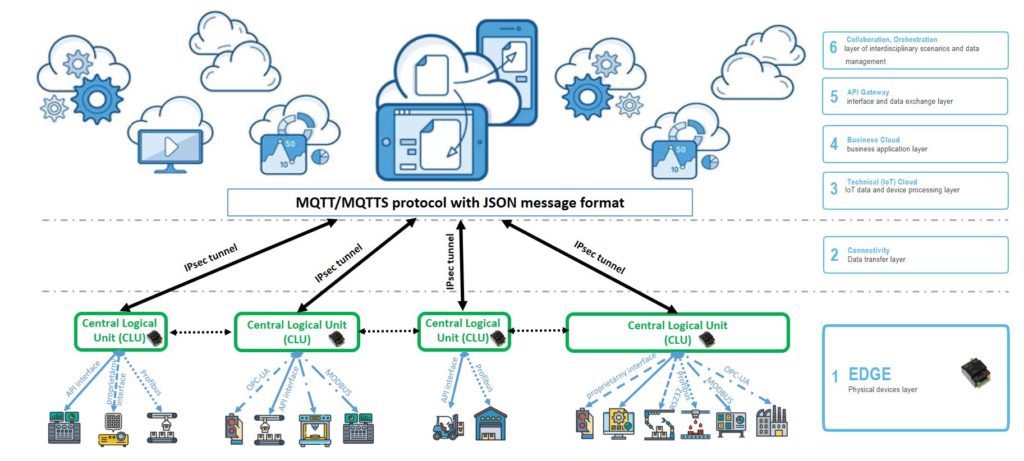
Description of system architecture layers (from EDGE to Cloud)
The WorkSys system can cover all layers of the IT architecture. Thanks to the efficient and scalable EDGE layer, it can combine technologies such as software in efficiently concentrated locations and homogenize and streamline data transport to the cloud layer.
The EDGE layer is usually installed in the production or logistics part of the company and at the same time creates a place for temporary data backup in case of loss of connectivity to the cloud layer. Data transfer to the cloud layer mostly bypasses the “regular” Internet and thanks to IPSec tunnels, it is completely secure, without the possibility of “capturing” data during transfer. The security of the WorkSys system is one of its dominant advantages.
Basic functions
Access to the WorkSys system is possible for users through the web interface through the appearance of the relevant URL link (e.g. https://app.prodxx.worksys.space), which was determined for you by the solution supplier. The web connection is encrypted via HTTPS. HTTPS (Secure Using Hypertext Transfer Protocol) is a secure version of HTTP that uses the SSL /TLS protocol for encryption and authentication.
The HTTPS protocol allows website users to securely transmit sensitive data such as credit card numbers, banking information, and login credentials over the Internet. For this reason, HTTPS is especially important for securing online activities such as shopping, banking, and remote work. However, HTTPS is quickly becoming the standard protocol for server everything, regardless of whether they are exchanging sensitive data with users.
The actual URL of the system may differ from the above based on customer requirements. Before logging into the system, it is necessary to make sure that access to the platform has been established and set correctly (delivery of login data).
On the initial page, the user is asked to authenticate using a username and password. The system allows defining multiple users, each with different rights and authorizations. The creation and management of users is ensured by the system administrator. If you do not have access data, contact the solution supplier.
After entering the correct URL link in the web browser (e.g. Google Chrome is recommended), the login screen will appear.
WorkSys login screen
After correctly filling in the login name (Email) and password (Password), press the Sign in button to log in to the WorkSys platform.
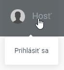
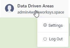
User logout
Clicking on the logged-in user in the upper right corner opens a menu with a menu. Selecting by pressing the Logout box logs the user out of the system and displays the login screen.
Log out of the system on the home screen
Logging out of the system can be done in any part of it, because this part of the top menu is always available to the user, regardless of which part of the system he is in.
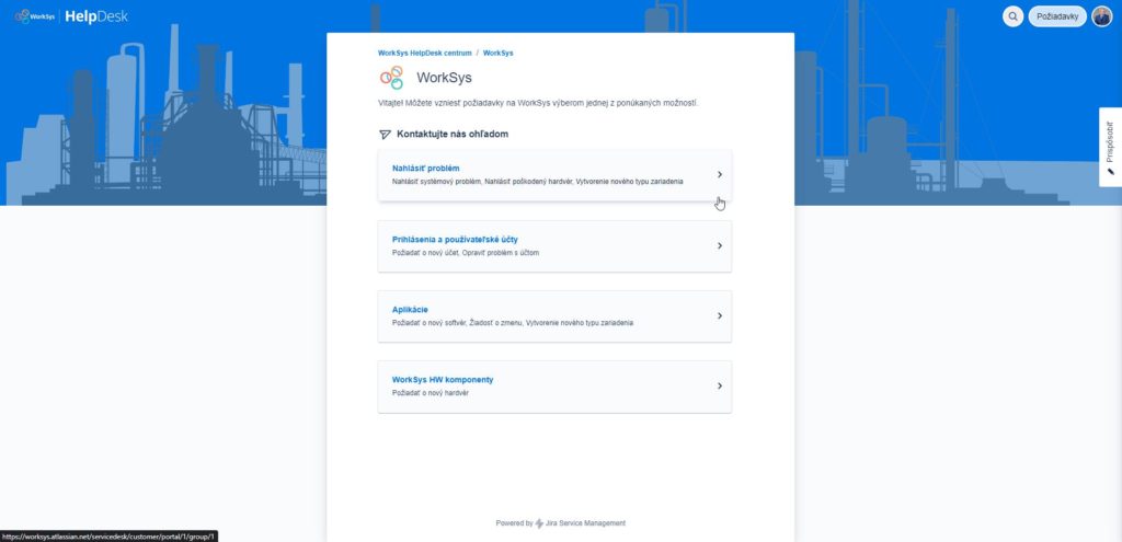
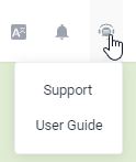
Access to support - HelpDesk
By clicking on the support icon, you will see a functional menu from which you can choose to switch to the Support page (Helpdesk). Access to the support page (Helpdesk) is created by your WorkSys supplier and is for selected key users.
Switching to the support page (Helpdesk)
Support page (Helpdesk)
It is also possible to view the online documentation by clicking from the given menu.
Switch to the online documentation page.
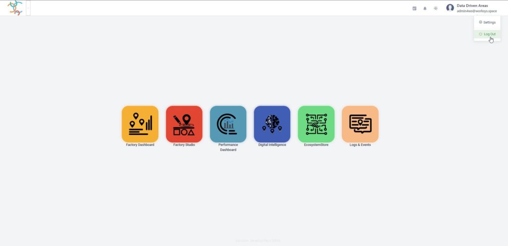
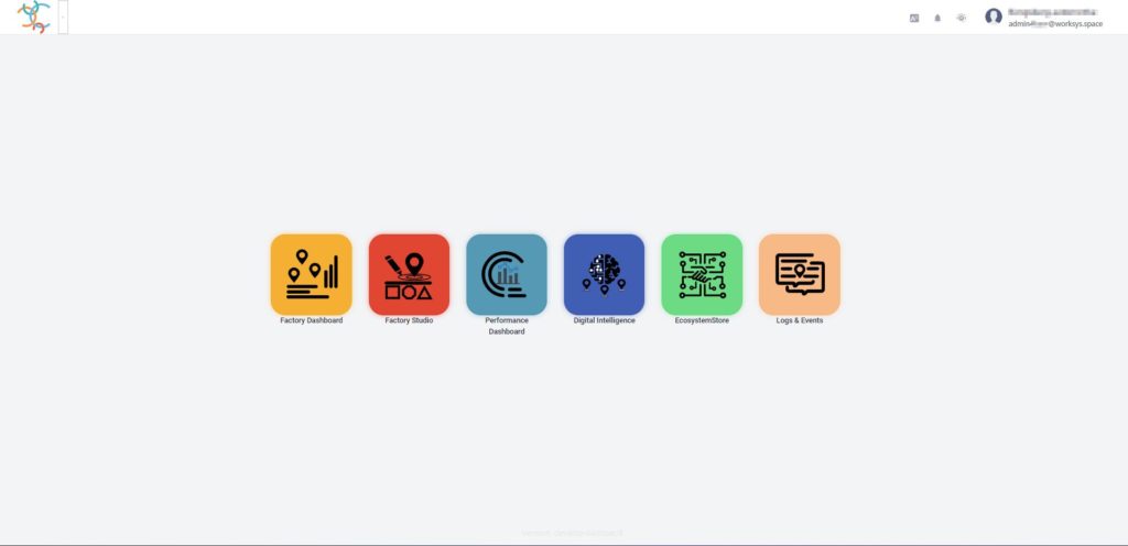
Home page
The initial screen is the first thing a user sees after logging into the WorkSys system. We took great care to ensure that all graphic components are user-friendly and intuitive. We also made sure that the user does not dive deeper than 3-4 levels, so that he can mentally maintain the level of immersion he is currently in.
It is very important for us, as the authors of the solution, that the user quickly and affectively navigates hundreds to thousands of data and objects without feeling the risk of getting lost in the system. Also for this fact, we were not afraid to make revolutionary decisions aimed at a disruptive view of the functionality of the graphic interface.
In the following sections, we will describe the individual parts available to the user.
Home page
If, despite these improvements, you still feel that something could be done more efficiently, don’t hesitate to let us know (e.g. below in the comments). We believe that together we will be able to improve the product to your satisfaction.
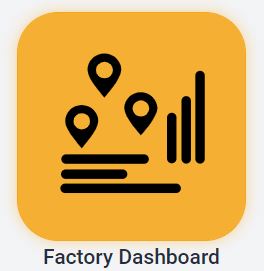
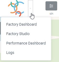
Factory Dashboard
It represents an alternative to a digital twin, extended by the possibility of several industrial objects or areas that are geographically distant. It enables visualization of individual digital points, digital areas or digital processes on a map basis. It can be used very effectively as a facility management tool with real-time data.
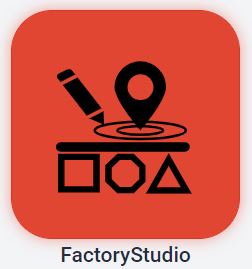
Factory Studio
It represents an advanced variant of device management. It allows the user to create objects directly on the map base, sort them into logical units and place them in the shape of the logical structure of the organization. The final definitions of the devices are then assigned to individual units and at the same time to the map base.
Performance Dashboard
It represents a modern and efficient paperless reporting tool, where users can create and manage individual reports (Panels) themselves. The panels are built as self-service (without the need for programming intervention) and are personalized. Panels consist of components in which graphs, images, videos, etc. can be placed. All data is visualized in real time.
Digital Intelligence
The system allows you to functionally link your own Business Intelligence or Digital Intelligence system directly from the platform for deeper and more detailed data analysis. The most frequently interconnected systems are e.g. Qlik, Power BI, Tableau and more. It is also possible to share their visual data interpretations (widgets) in the Performance Dashboard system.
Ecosystem Store
It concentrates and catalogs proven solutions in practice and offers customers the first alternative when looking for the appropriate functional part to cover the need for digitization of the given part. It is possible that you will find more possible alternatives there to solve your need. Of course, the WorkSys system allows you to integrate solutions other than those listed, including those you already have installed.
Log & Events
This part of the platform concentrates all important system reports and incidents, including notification reports. This gives you an absolute overview of everything that is happening in your tenant and whether everything is going according to your expectations.
Factory Dashboard
Factory Dashboard
It represents an alternative to a digital twin, extended by the possibility of several industrial objects or areas that are geographically distant. It enables visualization of individual digital points, digital areas or digital processes on a map basis. It can be used very effectively as a facility management tool with real-time data.
Factory Dashboard – Graphical elements on the top bar
The top bar is permanently present during the entire period of use of the Factory Dashboard part. It represents a place where all important functions are always available to the user (filters, online support, choice of platform language and others).
This section allows you to quickly switch the module without having to use the Platform Home screen.
KPI
By pressing the KPI icon, the lower part (under the bottom bar) displays a list of created graphic KPIs depending on the area marked in the left part of the menu tree structure. Likewise, a list of Performance Dashboards relevant for selection from the left menu is displayed under the bottom bar.
The KPI (Key Performance Indicators) window serves to quickly create a graphic representation of the recorded data for their analysis over time or for comparison with other data. The KPI window is displayed by activating the corresponding icon on the top bar or the icon at the bottom of the screen (Show all).
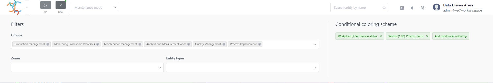
Filter
By pressing the Filter icon, the details of all types of filters will be consolidated in a separate screen (list of marked areas in the right menu, selection of objects from the left menu as well as selected conditional coloring schemes.
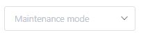
Selection of maintenance mode
The drop-down menu allows you to select the maintenance mode corresponding to the selected piece of technology or software. User options are fully dependent on assigned maintenance permissions. If you do not see this component, you have not been assigned any maintenance repair.
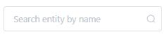
Search window
If you know the name of the object, by typing it in the search window, it will be offered to you for clicking, thus speeding up the search for objects in systems with a larger number of digital points.
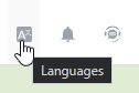
Language selection for the web graphical interface
By clicking on the given icon, you can smoothly switch the communication language without the need to log out of the system. Among the basic installed languages are (Slovak, Czech, English, German). If necessary, the supplier can add another necessary language.
Watcher
By clicking on the given icon, a list of entered alarms will be displayed. It is also the way to enter new alarms. The goal is a feature where the platform guards the data limit values from digital objects you specified, regardless of the place of their creation.
Online Support (HelpDesk)
By clicking on the given icon, the option to start online support (Helpdesk) or to switch to online documentation will appear.
User profile
By clicking, the option to change the previously used password via Settings or to correctly log out of the WorkSys platform (Logout) will appear.
Factory Dashboard – Map Layer
The map background is used for a basic and clear visualization of the localization of regions, zones and individual facilities. The position of the element is defined by placing it on the map base (using GPS coordinates). It is possible to enter a position as a polygon (typically regions and zones) or as a single point (typically a device). However, it is also possible to enter the device itself as a polygon (area on the map). If the device is a location on the map as a point, it is displayed with its specific icon, which is defined within the device type (entity type). The icon cannot be changed by the user, but the user can specify the color of the icon (fill color) when creating the device. The list of icons is dynamically expanding and is therefore not part of this document.
The display of elements on the map base is conditioned by filters:
region and zone filter (Right menu)
device type filter (Left menu)
combined filter (Top bar – Filter)
filter for conditional coloring
By activating/deactivating individual filters, the current display of elements on the map is dynamically adjusted. Using the buttons (+ / –) or using the wheel on the mouse, the map background can be zoomed in and out. By holding down the CTRL key and the left mouse button at the same time, it is possible to change the tilt of the map view by dragging the map background. This function can also be performed by pressing both mouse buttons at the same time and dragging up or down. down.
By clicking on a specific element on the map (region, zone, classification) its detail will be displayed in the right menu and at the same time the icon of the selected device will start to move.
If the map zoom setting causes the icons to overlap (the icons do not change their size when the zoom is changed), a grouping of devices (the so-called cluster) will be created. By clicking on the group icon, a window will appear with a list of devices inside the group.
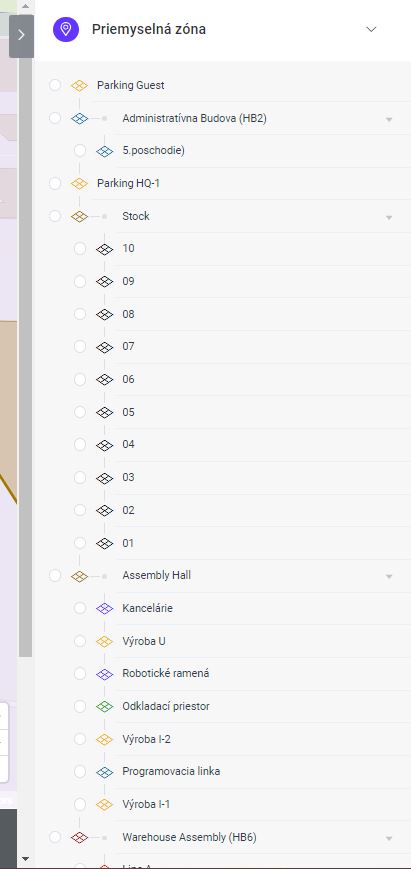
Factory Dashboard - Left menu
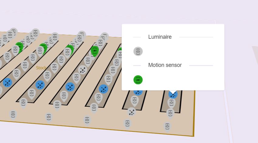
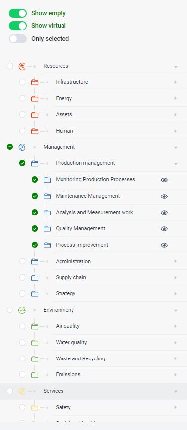
The left menu, or the tree of device types, serves as a graphically controlled filter of devices displayed on the map background. In the highest level (collapsed list) the device categories are shown. Expanding the category will display below the category and then specific device applications (for example, Lighting). For each item in the list, there is a box for activating the given filter. Activating/deactivating a higher-level item simultaneously activates/deactivates all its nested items.
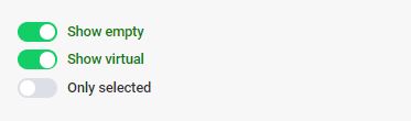
In the upper part of the menu there are switches that filter the list of categories:
Show empty – if the switch is on, items that do not have any digital objects assigned to them (points or polygons on the map) are also displayed in the left menu.
Show virtual – if the object in the Status field has the value virtual and the switch is on, then the point is visualized on the map background.
Only selected – if the switch is on, only tree items that the user has clicked on until then are displayed. It is used to simplify the structure of the left menu items.
The current state of the filter directly affects the display of devices on the map. If no device category is active, then no device is displayed on the map. The filter settings on the left menu are also dynamically transferred to the filter settings within the Filter window.
When you expand the list of categories to the lowest level, there is an eye icon for each item. After clicking it, the setting of the conditional coloring of the given type of device will be displayed according to the value of the selected attribute (for example, the state of the device or the brightness of the lamp). Conditional coloring enables a quick visual inspection of the status of devices based on the value of the device parameters. The attributes of devices that support conditional coloring are defined by the definition of the device type and can be modified according to the customer’s needs in cooperation with the implementation partner.
Factory Dashboard – Right menu
The right menu is able to cover several functions. After opening the Factory Dashboard application, it displays the Organizational Structure (regions and zones). By selecting a specific zone and on the map background, they display objects that are the sum of the conditions indicated in the left and right menus. This means that all objects that correspond to the clicked types in the left menu are displayed, but only for the zones clicked in the right menu.
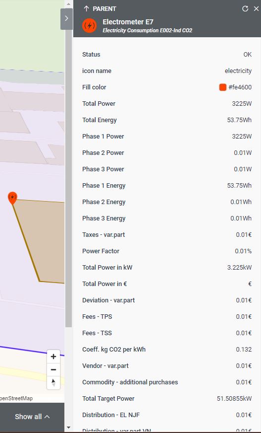
When selecting (clicking on an object) a specific device (on the map background, in the device tree or in the search), the detail of the given device is displayed in the right menu.
The name of the given object in the WorkSys system is displayed next to the icon of the selected object. And under the name, the object type is displayed in smaller letters. These two pieces of information are very important when creating charts. With the name of the object, we determine which object we want to graphically visualize, and thanks to the object type, the system recognizes a list of attributes whose values can be visualized.
The buttons in the upper part of the window are used for navigation within the right menu. Their functions are as follows:
Return to the previous context.
Skip to the logically parent element in the tree structure.
Refreshing the displayed values (the last reported data from the device is loaded).
Close device detail. Return to Organizational Structure.
Factory Studio
Factory Studio
It represents an advanced variant of device management. It allows the user to create objects directly on the map base, sort them into logical units and place them in the shape of the logical structure of the organization. The final definitions of the devices are then assigned to individual units and at the same time to the map base.
Factory Studio combines the possibility of creating a logical structure of layers (e.g. according to geographical location) with the location of individual digital devices.
The top bar is permanently present during the entire period of use of the Factory Studio part. It represents a place where the user always has all important functions available via individual buttons.
This section allows you to quickly switch the module without having to use the Platform Home screen.
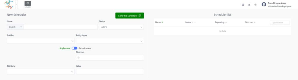
Scheduler
If it is necessary to change a specific value at a precisely specified time, the function of the change scheduler can be used.
Medium set of functional icons
Creation and editing of regions (the highest level of the structure). It mostly determines the outer boundaries of the digitized part.
Creation and editing of zones in any structure.
Creation and editing of devices (digital points).
Possibility to use the image file type (JPG, BMP, etc.) as a drawing background (image overlay) when creating and placing regions, zones or devices.
Language selection for the web graphical interface
By clicking on the given icon, you can smoothly switch the communication language without the need to log out of the system. Among the basic installed languages are (Slovak, Czech, English, German). If necessary, the supplier can add another necessary language.
Watcher
By clicking on the given icon, a list of entered alarms will be displayed. It is also the way to enter new alarms. The goal is a feature where the platform guards the data limit values from digital objects you specified, regardless of the place of their creation.
Online support
By clicking on the given icon, the option to start online support (Helpdesk) or to switch to online documentation will appear.
User profile
By clicking, the option to change the previously used password via Settings or to correctly log out of the WorkSys platform (Logout) will appear.
Factory Studio – Regions
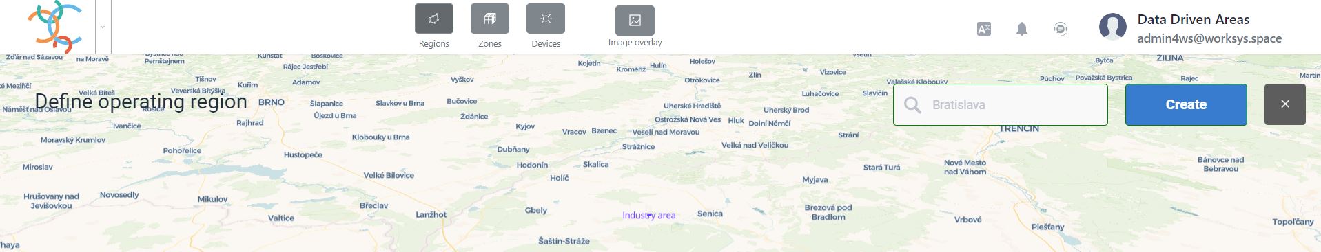
The procedure of steps to establish a region, as the outer border of the digitized area. The boundaries can be clicked out as a polygon (joined GPS coordinates) and changed at will.
Step No.1
When establishing the first region, the system offers the possibility to find it on the map by name or address.
When filling in additional regions, the same search option as for the first region will be offered on the screen after pressing the Start button. In this way, it is possible to create several regions at the same time, even with the correct geographical location.
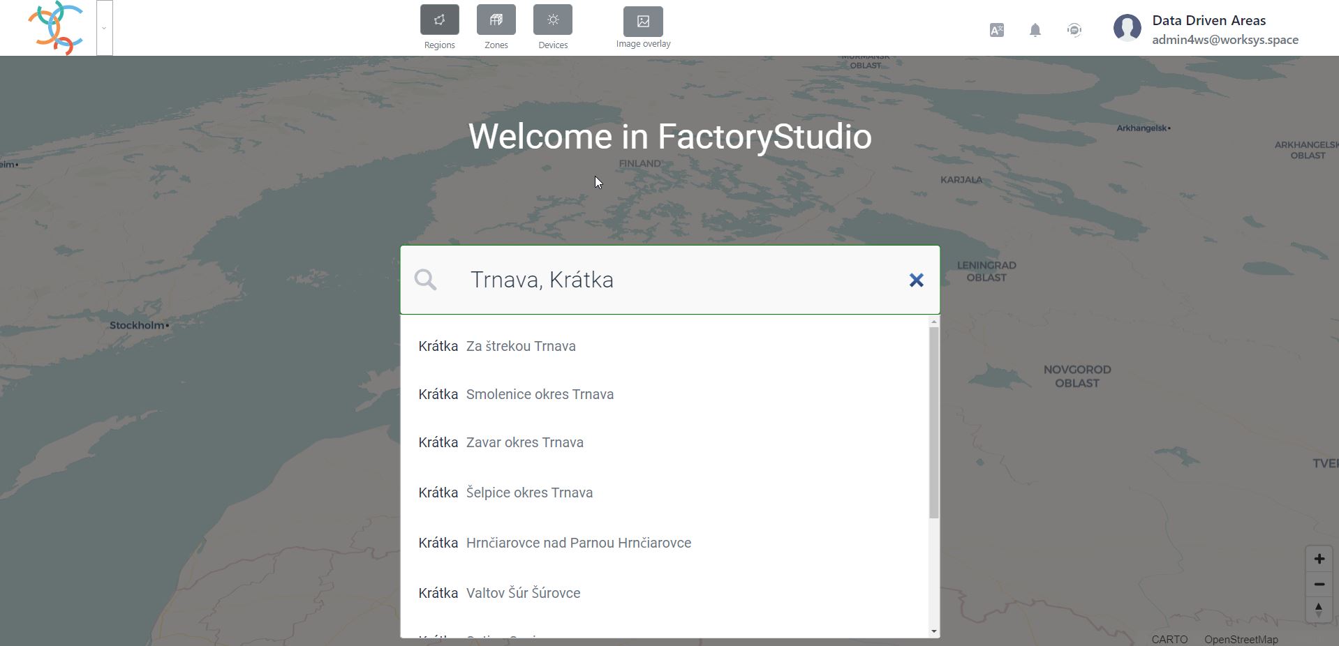
Step No.2
Enter the city and address of the part you are looking for in the search field.
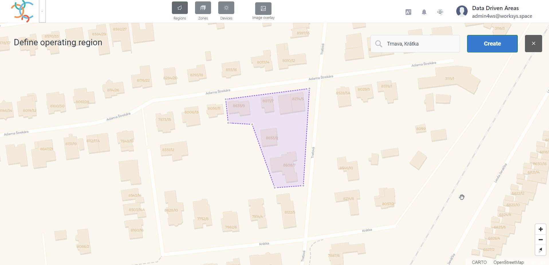
Step No.3
Create a polygon by clicking individual points on the map base. The polygon is closed automatically with the last click on the first created point of the region on the map.
Step No.4
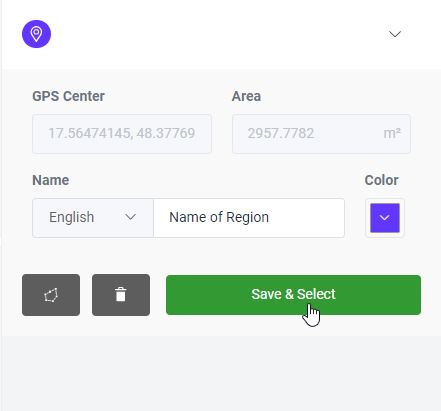
Press the Create button and fill in the Region Name and select the color of the region. The system also automatically calculates the estimated area of the region.
Step No.5
After filling in all the necessary data, press the Save & Select button and the system will automatically switch you to the Zones section.
If you need to move or change the region, you can use the polygon change icon (the first icon in the row of buttons).
If it is necessary to delete the region, it is necessary to press the delete button (middle icon in the row of buttons). The system will ask for confirmation for security.
Warning: In case of region deletion, all subordinate zones and devices are automatically deleted!
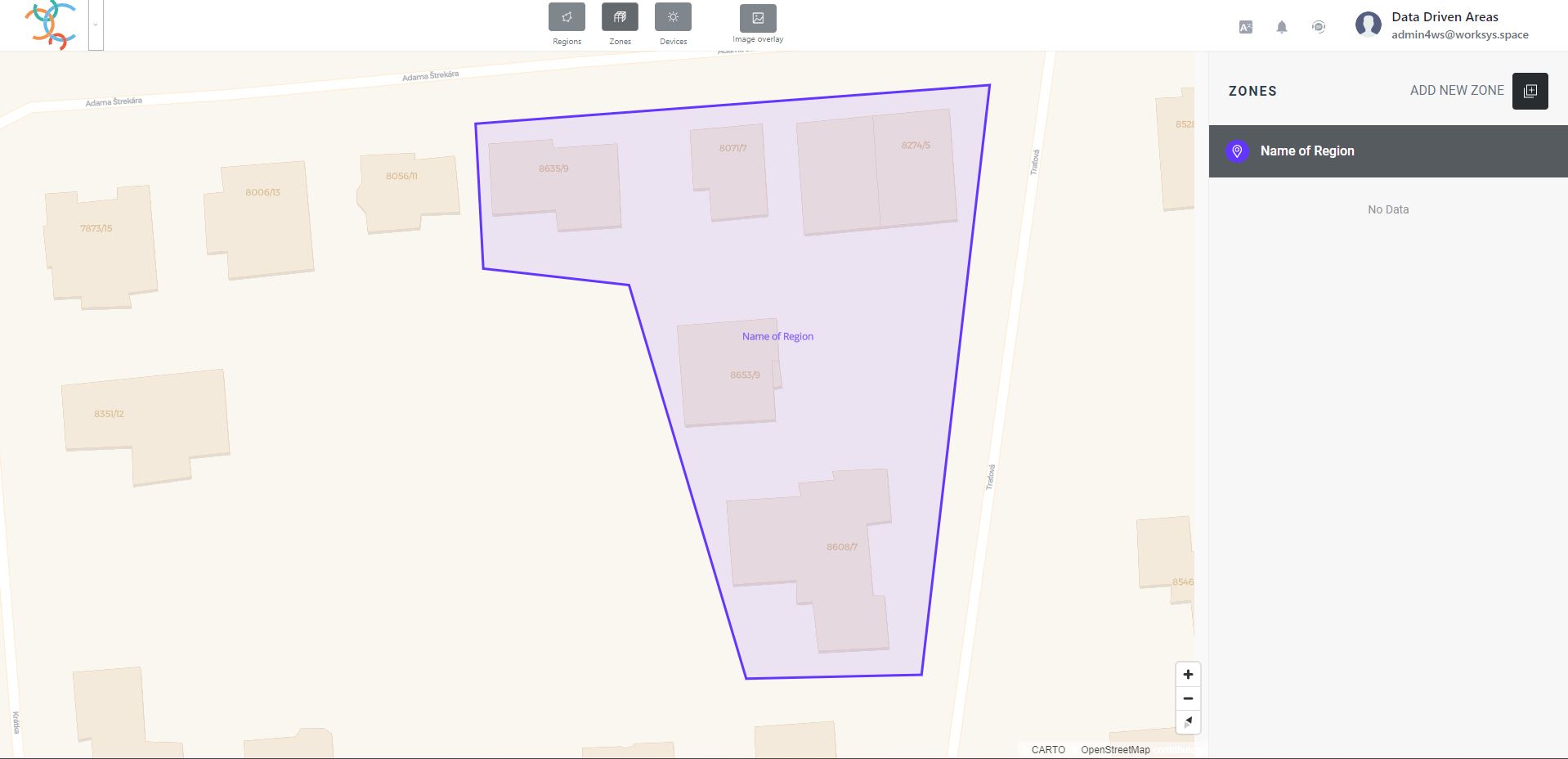
Factory Studio – Zones
A sequence of steps to establish a zone or multiple zones in a different logical structure in the selected region. Zones are objects inferior to the region in the digitized area. The boundaries of the zone can be clicked out as a polygon (connected GPS coordinates) and subsequently changed at will and at any time.
When establishing zones, it is very important to realize that I am actually creating an organizational structure under the selected region. The organizational structure will serve us as a guide in the right menu with the option of selecting the display. At the same time, the zone serves as a place where it is possible to assign a device or other digital entities.
Step No.1
A zone can be created with the “+” icon either at the level below the region or below an already existing zone.
Creation of a zone under the created region.
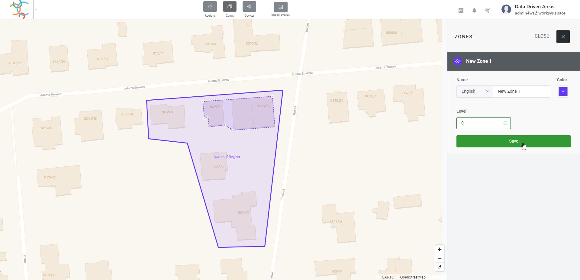
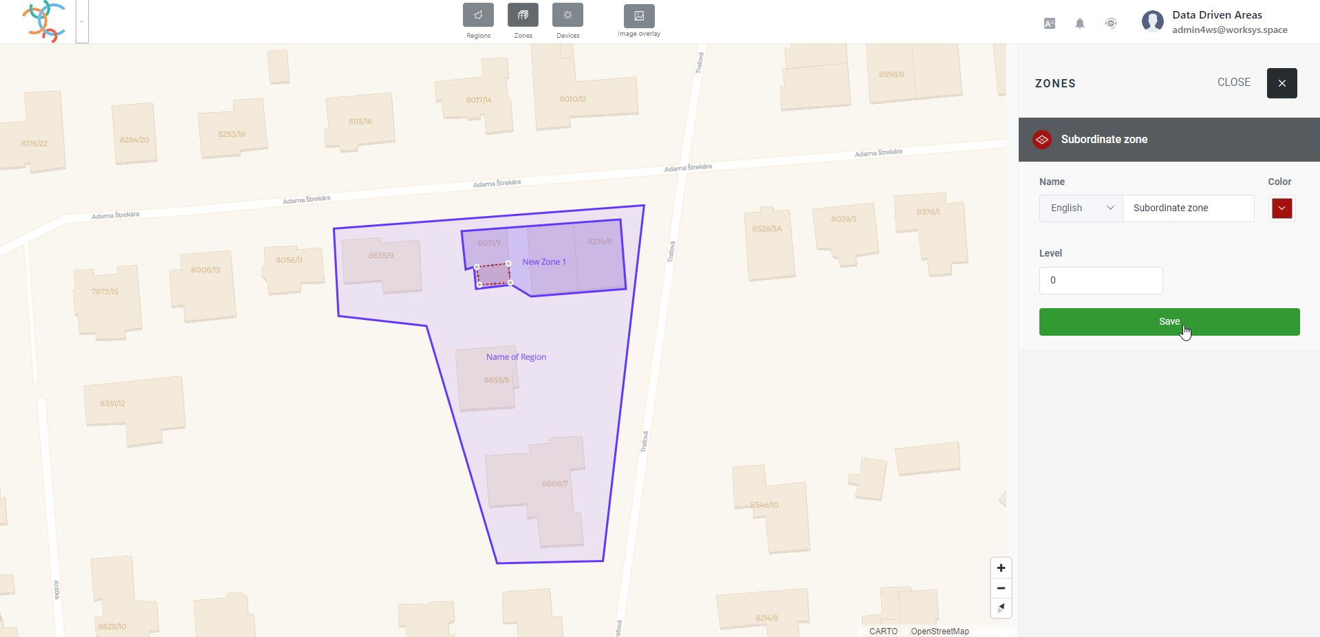
Create a polygon by clicking individual points on the map base. The polygon is closed automatically with the last click on the first created point of the zone on the map. Then you write the name of the zone and choose its color.
The Level field represents the number of the floor at which the given zone will be displayed. In the case of multi-story objects, it is possible to distinguish a different floor plan of the zones or the shape of the object itself through the Level field.
Warning: If the value is not filled in, the given zone will be displayed on the map background in the Factory Dashboard, regardless of the selected floor level.
Step No.2
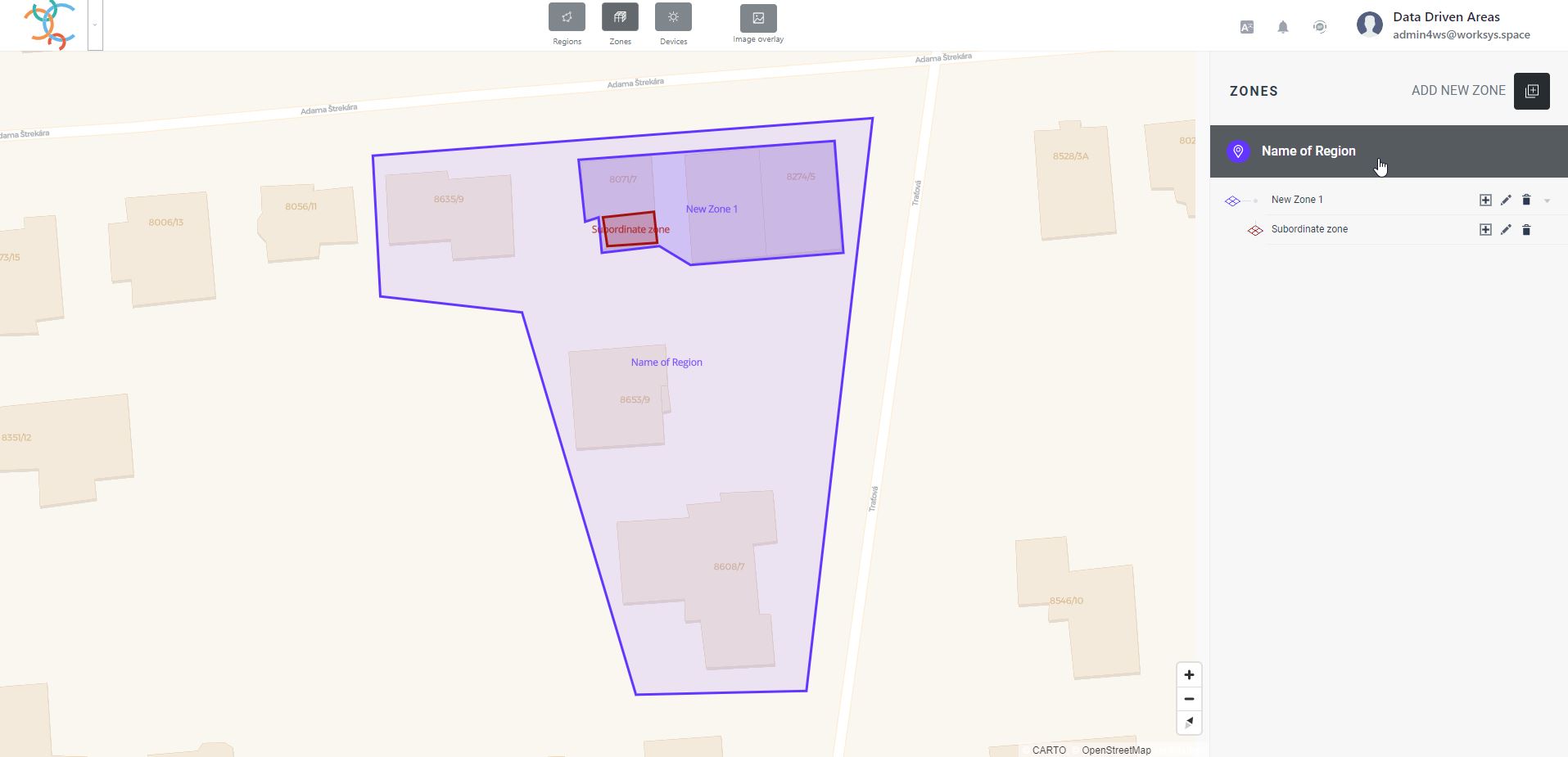
To create a subordinate zone to an already existing zone, the (+) icon is used next to the name of the already existing zone.
Step No.3
To create a subordinate zone to an already existing zone, the (+) icon is used next to the name of the already existing zone. the next procedure is the same as Step No.1.
In this way, it is possible to create an arbitrarily deep and wide structure, which will become an excellent guide for further processing of data from assigned devices (creating totals, averages, determining maximum or minimum values, etc.) for any zone and all its subordinates. This significantly speeds up the creation of graphs or their graphic outputs in the KPI section of the Factory Dashboard or the Performance Dashboard.
If you need to move or change the zone, you can use the pencil icon to change the polygon. Subsequently, the relevant zone is identified with a dashed line, and by repeatedly clicking the identified object with the left mouse button, the polygon becomes editable. This fact is visually identified by the fact that the individual GPS points of the polygon turn into white circles, which can be manipulated as when setting up an object.
If it is necessary to delete the zone, it is necessary to press the delete button. The system will ask for confirmation for security.
Warning: In case of zone deletion, all subordinate zones and devices are automatically deleted!
Factory Studio - Devices (Device Management)
The last, but not least, part of Factory Studio is the device management part.
Each Device can be assigned to a Region, Zone or even to an existing device.
The procedure for setting up a new device is very simple. However, it is very beneficial to realize that devices (or other data input objects represented by a device) are the source of the data that will be subsequently processed.
When setting up the zones, we made sure that the organizational structure was created correctly, and now we should make sure that the device assignments are in the right zone and at the right level, so that they then easily provide the right data for the graphs.
Step No.1
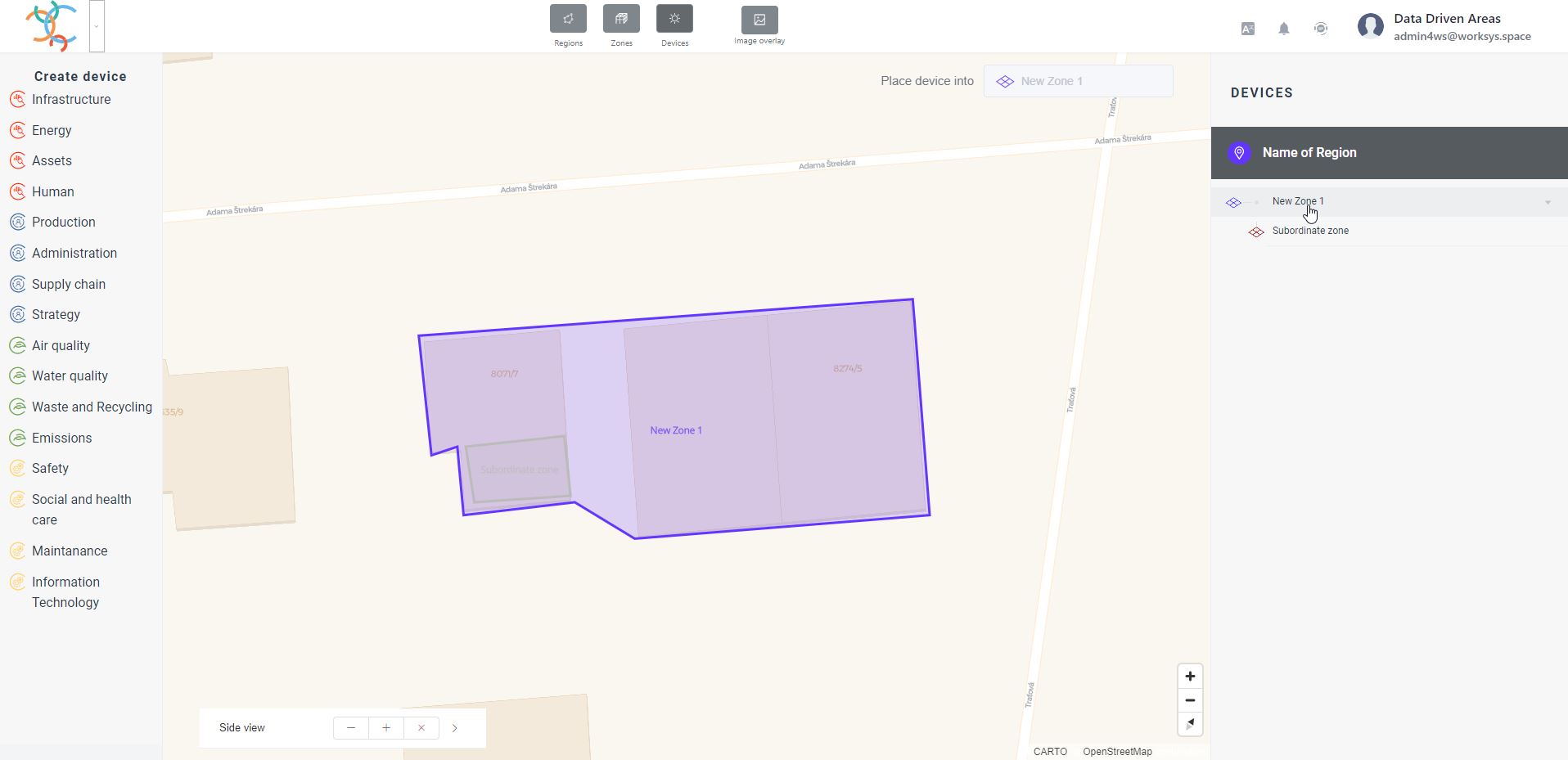
Click on the Devices icon to switch to Device management
Switch from zone management to device management
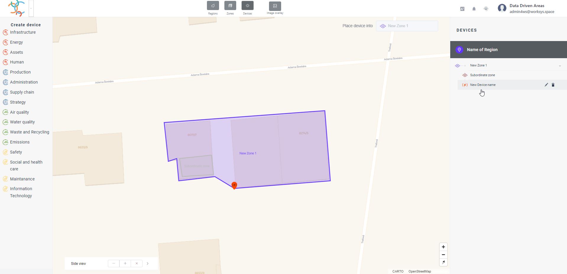
Step No.2
Click in the right part of the organizational level (on the corresponding zone) to set the connection point of the newly created device. To verify the connection location, its name can also be found in the Place device into in the upper right corner of the map background.
Step No.3
By clicking on the left part of the menu with device areas (on the relevant device area), individual devices will be expanded. By selecting them, you can place the relevant device on the map background. The establishment can be created as:
Polygon – if the facility is spatially significant, e.g. a line or a large machine, where a simple point on the map base would not adequately capture its essence
Point – A point will appear on the map (teardrop shape with a device icon)
Without position – this selection is used if we place another device under the existing one and the subordinate device has the same map position as the device under which we assign it
Step No.4
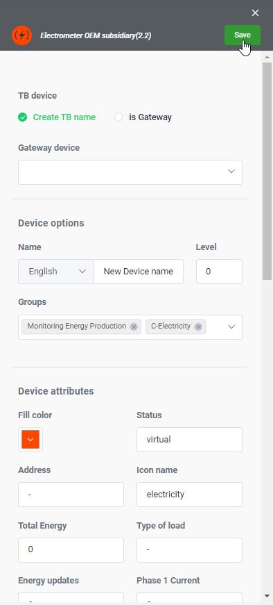
After selecting the location, the fields for filling in for the new device will appear in the right part of the menu.
By clicking on the Create TB name click field, you will create a unique device identifier (usually a number), which, after saving by pressing the Save button, will be automatically generated in the TB name field, which is not yet visible when the Device is created.
It is also important that you fill in the Device Name and assign the device to the appropriate Group (also by selecting it) from the left menu structure of the Factory Dashboard.
Multiple group identifiers can be assigned to the Group field, as it is logical that some devices are used for multiple purposes. e.g. The camera can be used for security control and so it will be in the Security section, but at the same time, thanks to AI functions, it can also be used for counting products or workers, and therefore it can also be assigned to the Production Monitoring group.
Step No.5
After saving a device, the corresponding device also appears in the right logical or organizational structure.
In case you need to change or delete a device, it can be done with the corresponding icons displayed at the level of the device name (Pencil = change and Trash = delete device).
Of course, it is also possible to change the initial color of the icon, or to change the initial values of individual attributes. The values of individual attributes can be changed at any time, and the system treats the change as if the given data was obtained directly from the device. Thanks to this feature, Factory Studio can also be used for data entry.
The timestamp of the attribute value change corresponds to the date and time the given change was saved. The system selectively identifies only changed data.
Factory Studio - Import data from Excel (CSV)
The most common source of data to the digital entities created in Factory Studio are the integrated devices themselves, which send data to the Digital Entities.
However, a very common case is the need to import data from Excel. At the same time, this function helps bypass the need to initially import data from other software. However, it can also serve as an integration tool for the regular consolidation of company Excel files into the common data platform WorkSys.Space without the need for programming skills.
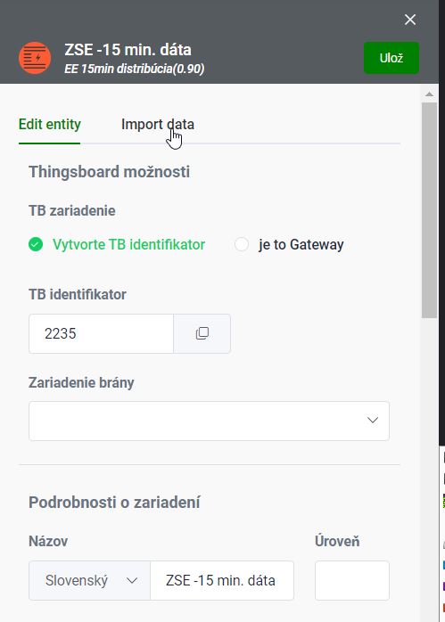
If the Digital Entity allows the import of external data, the Import data tab is taken in the device (Digital Entity) definition section.
The sequence of steps is very simple.
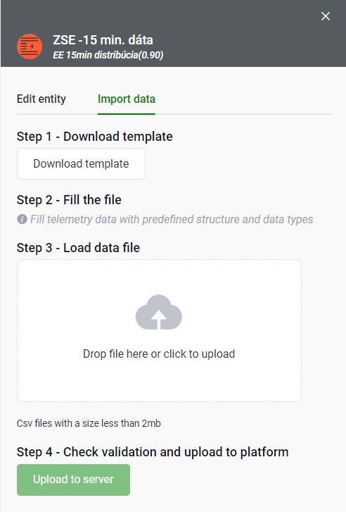
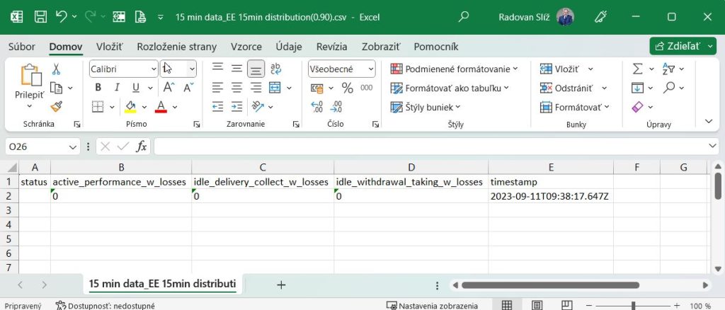
Step 1 – allows you to export an empty template of the future import file. Export is done as a CSV UTF-8 (comma-separated) (*.csv) file.
Then we open the file in the MS Excel application and leave all fields primarily as text during import.
Step 2 – fill the file with the necessary values in the MS Excel application. While filling in, we can fully use all Excel features, including formulas and so on.
The following rules must be observed:
do not use any thousands separator for numbers
use a dot “.” for numbers. as a decimal separator
adhere to the date and time format for the timestamp field. (Therefore, during export, the system generates the current time in the correct format).
The data of the entire row will be saved at the date and time specified in the timestamp field.
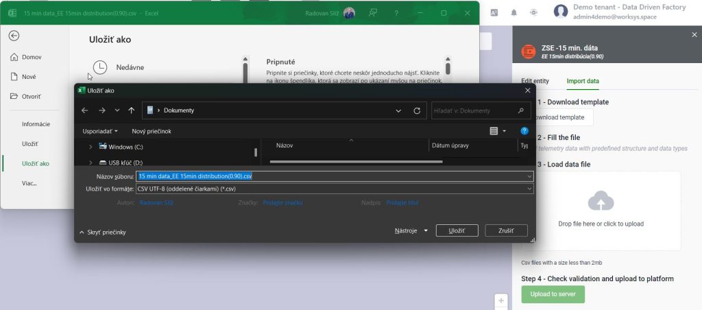
After filling in the necessary data, the contents of the file are saved as CSV UTF-8 (separated by commas) (*.csv) and the file is ready for import.
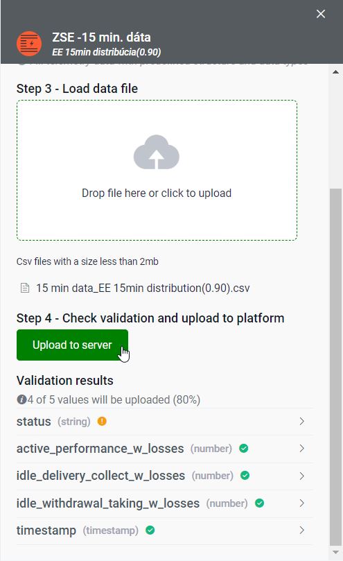
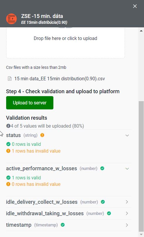
Step 3 – by dragging the file into the selected space, we upload the filled CSV file.
Step 4 – The system automatically checks the input data for the correct format and prints the statistics of the resulting checks. If you are satisfied with the checks, by pressing the Upload to server button, all valid data will be imported.
Performance Dashboard
Performance Dashboard
It represents a modern and effective paperless reporting tool, where users can create and manage individual reports (Panels) themselves, with subsequent inclusion in the relevant functional categories for the needs of effective filtering. The panels are built as self-service (without the need for programming intervention) and are personalized. At the same time, however, they include the option for the panel owner to be able to share the Panel with other users as well. Panels consist of components in which graphs, images, videos, formatted texts, as well as foreign parts of web components in the form of iframes can be placed. All data in the components are visualized in real time as they flow into the system.
Performance Dashboard – Graphical elements on the top bar
Performance Dashboard offers users the opportunity to create their own Dashboards, which can be shared with other users if needed. Panels represent a system of user-arranged graphic components (widgets). Size, location as well as content is completely in the hands of the user without the need for any knowledge of programming reports or graphs.
It is a basic analytical interface that is used to create graphs and statistics for the analysis of data collected from devices. the number of panels as well as their content is not limited by anything. Individual panels can also be linked to the KPI interface in Factory Dashboard.
The top bar represents a place where the user always has all important functions available via individual buttons.
This section allows you to quickly switch the module without having to use the Platform Home screen.
Language selection for the web graphical interface
By clicking on the given icon, you can smoothly switch the communication language without the need to log out of the system. Among the basic installed languages are (Slovak, Czech, English, German). If necessary, the supplier can add another necessary language.
Watcher
By clicking on the given icon, a list of entered alarms will be displayed. It is also the way to enter new alarms. The goal is a feature where the platform guards the data limit values from digital objects you specified, regardless of the place of their creation.
Online Support (HelpDesk)
By clicking on the given icon, the option to start online support (Helpdesk) or to switch to online documentation will appear.
User profile
By clicking, the option to change the previously used password via Settings or to correctly log out of the WorkSys platform (Logout) will appear.
Performance Dashboard - Left menu
The left menu, or device type tree, serves as a graphically controlled filter for the list of loaded Panels. In the highest level (collapsed list) the device categories are shown. Expanding the category will display below the category and then specific device applications (for example, Lighting). For each item in the list, there is a box for activating the given filter. Activating/deactivating a higher-level item simultaneously activates/deactivates all its nested items.
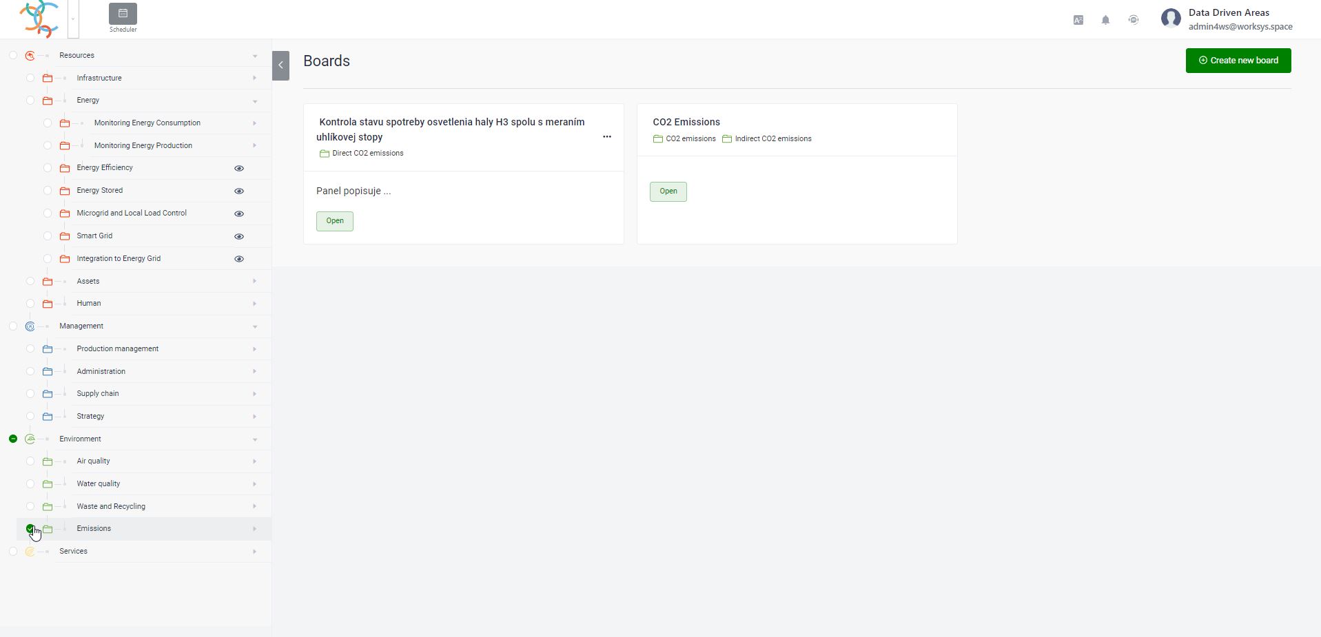
The list of displayed Panels is selectively changed based on the clicked categories. If no category is clicked, all Panels created by the user or shared for him are displayed.
The following images show a list of all user Panels if no category is clicked and the case when the user clicks a category.
Performance Dashboard – Board
The Board creates the possibility to create your own group of Components that serve to visualize measured, calculated or otherwise obtained data.
The Board for a better understanding of the internal content allows you to record the following fields and information.
List and meaning of individual fields
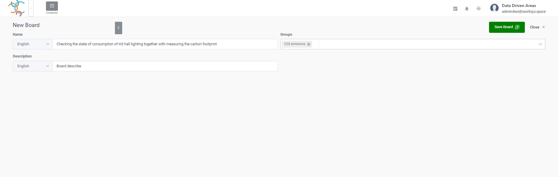
Name
In the name field, it is possible to insert the desired name of the Board created by us. It can also be saved in multiple languages by switching the appropriate language button.
Groups
In the Groups field, it is possible to insert (click out) a list of menu parts for which the display of the created Board is relevant.
Description
Allows you to add descriptive information to better illustrate the content of the Board. This field is optional. Likewise, this information can be maintained in several languages by clicking and switching to the appropriate language field.
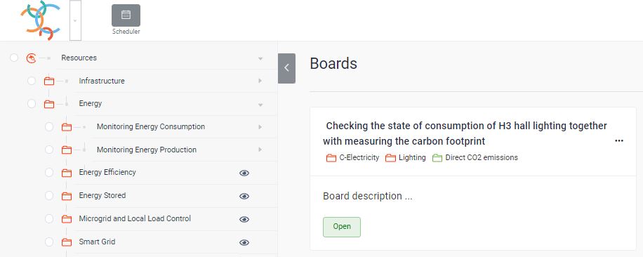
After pressing the Save Board creation button, a new panel will appear on which all the entered information can be found.
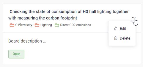
If necessary, it is possible to change or delete the given Board via the icon (…) at the top right for the created Panel.
Through the Edit mode, it is possible to add to the list of individual existing users in the WorkSys system and to set them a form of access to the internal components of the Board. Other than the owner of the Board does not have the possibility to change the access settings to it.
Performace Dashboard – Components
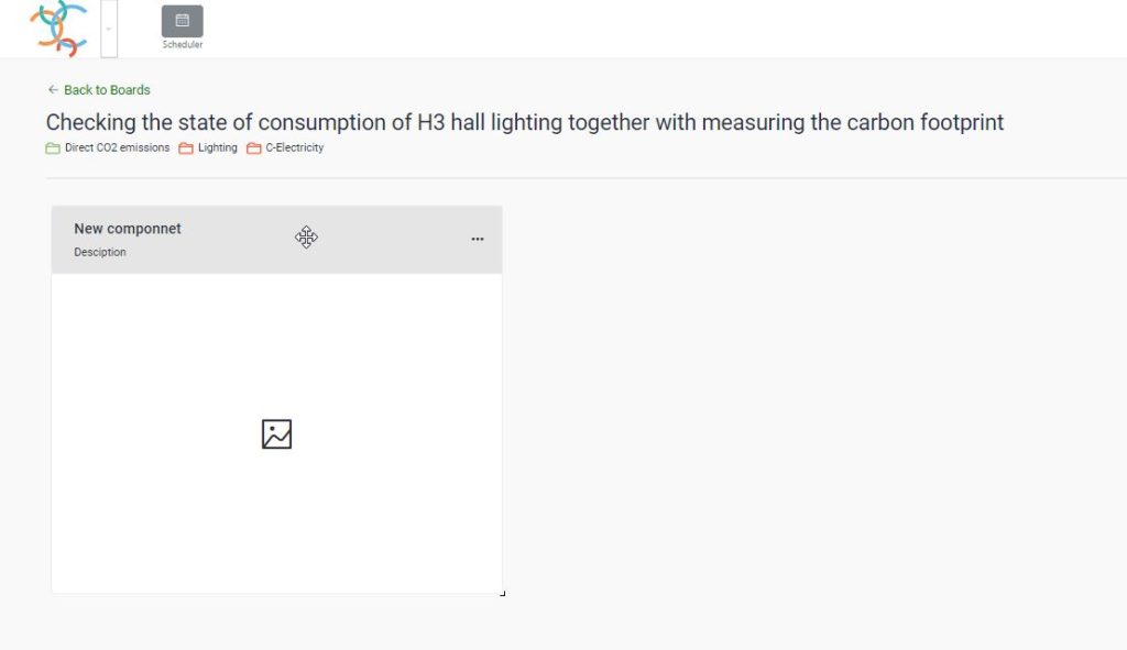
The Component represents a visual place for one object (graph, image, video, etc.) with freely adjustable width and height in the corresponding Board. Of course, the Board can contain more Components. To create a new Board component, the Create button is used to open the corresponding Panel with the name New Component.
It is necessary to define all input fields.
List and meaning of individual fields
Name
In the Name field, you can enter the desired name of the component being created. It can also be saved in multiple languages by switching the appropriate language button.
Description
Allows you to add descriptive information to better illustrate the content of the Component. This field is optional. Likewise, this information can be maintained in several languages by clicking and switching to the appropriate language field.
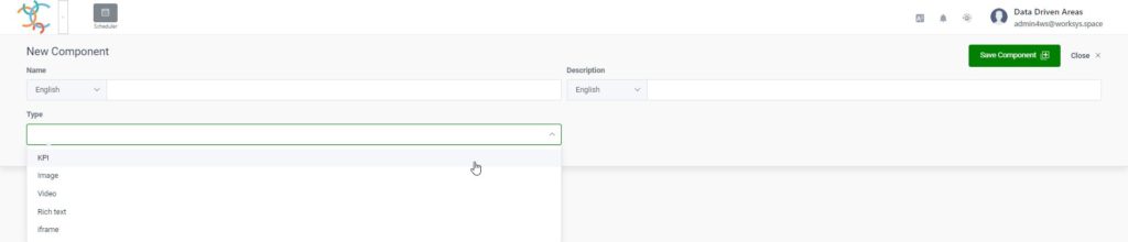
Type
In the Type field, you can select the type of objects that will be included in the given component.
List of individual types of objects
KPI
KPI represents a graphical interpretation of the data stored in the WorkSys system. The types as well as the options for creating KPI variants are described in the next sections.
Image
Allows you to insert an image into the corresponding component. The image definition is in the form of a URL link.
Video
Allows you to embed a video into the appropriate component. The image definition is in the form of a URL link.
Rich text
It allows you to insert text and then format it in order to prepare a full-fledged graphic visual of the report.
iframe
Allows you to insert external web content in the form of a URL link.
Visual change or relocation of a Component
To change the position or size of the Component, the Edit box must be enabled (in the line with the name of the panel).
Subsequently, it is possible to move the given component up to the panels by clicking and holding the mouse on the title line of the component. The system automatically “cleans” the other existing components of the Board.
If you need to adjust the size of the component, you need to click on the lower right corner (visually bounded by a small black border) and drag to adjust the size of the component.
The system automatically “cleans and adjust” the other existing components of the Board.
Note: If Edit is not enabled, the above functions are not available.
Performance Dashboard - Creation of a KPI type component
The KPI type component serves to quickly create a graphic representation of the recorded data for their analysis over time (comparison of the same time periods) or for comparison with other data. In the same way, the KPI type can also present the frequency of the condition in the form of pie or donut charts. In the following section, we will describe the individual types and how they are established.
Creating a KPI component
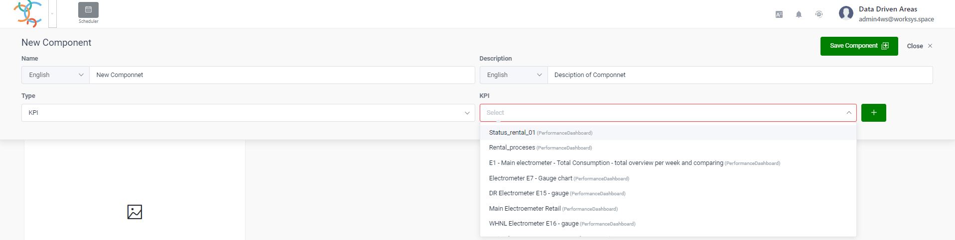
After selecting a KPI in the Type field, a new KPI field appears. If you order a new chart, do not fill in the field, but press the (+) button. See the following picture.
If we want to use an existing KPI definition, just select it from the offered menu. That is why it is very important to mark individual KPI definitions well and comprehensibly.
What is KPI definition?
The KPI definition represents a web interface that determines for a given component what data will be selected for processing (a selection request is created in the background – the SQL request) and how it will be visualized and interpreted. The method of selection and the method of visualization is determined by how the fields in the individual tabs will be filled. In this way, we are able to create relatively complex selections and visualizations without the need for knowledge of a programming language.
In the following section, we will describe the individual fields of the form for a better understanding of their functionality and meaning. It may happen that selecting a value in a field hides or shows some fields. It’s not a bug, it’s a feature.
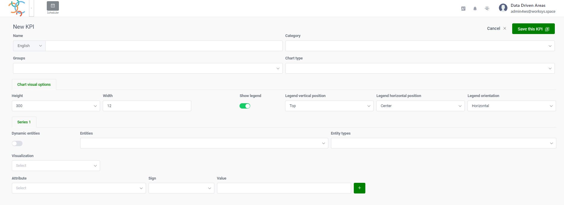
Creating a KPI definition
A KPI (definition) can be considered as a separate object within the WorkSys platform, which can be worked with in different places of the platform. Visually, the main screen looks like this.
The basic parameters of each KPI definition are as follows:
Name
The user name for the given KPI definition and, as we are already used to, it is possible to enter different language translations for the Name.
Category
The Category field determines what will be visualized on the Component and has the following values:
Status – is used to count the devices corresponding to the selection according to the current value in the Status field. The status field should be included in every digital entity (device).
Other – serves to display all other fields of digital entities (devices)
Groups
The names of the relevant Groups are assigned to the Groups field (as well as by selection) from the left menu structure. It is for later easier orientation in the number of KPI definitions. Of course, it is also possible to assign more group identifiers, because it is logical that some KPI definitions are used for several purposes.
Chart type
The Chart type determines the visual form of data display and has the following options:
Pie chart – displays the value of an attribute other than Status and mostly serves to display the current value of several objects.
Gauge chart– displays the current value of the attribute on the dial semicircle (very often used for performance or consumption measurements)
Time scale chart – používa sa na zobrazovanie časového priebehu hodnôt jedného alebo viacerých atribútov digitálnych objektov
Table – this special component is used to display the measured and saved values of a digital entity (it can only be used for a specific digital object – Entity) with the option of exporting to a file in .csv or .xlsx format.
The visual part of the KPI definition, tabs and their fields
Tab - Chart visual options
In this section, let’s describe the fields that allow you to set the visual part of the KPI definition. All items are concentrated in the upper part of the tab Chart visual options.
The bottom image shows the basic ones for the Status Category, but with a different graph tip, some more may be added.
Description of individual fields:
Height
Represents the height of the component in points.
Note: We can mostly leave it in the original setting, because the size of the Component can be adjusted on the corresponding Panel through the lower corner with the mouse.
Width
Represents the width of the component in columns
Note: We can mostly leave it in the original setting, because the size of the Component can be adjusted on the corresponding Panel through the lower corner with the mouse.
Show legend (switch)
After switching on, the legend of the visualized values is displayed on the graph
Legend orientation
Determines where the Component legend is displayed relative to the vertical position. The options are Upper, Middle and Bottom.
Legend horizontal position
Determines where the Component legend is displayed relative to the horizontal position. Options are Left, Center, and Right.
Legend orientation
Determines how the Component legend is oriented. The options are Horizontal and Vertical.
Tab - Chart type specific options for Gauge chart
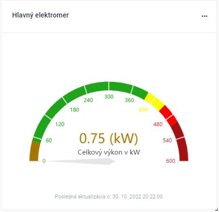
This is a visual preview of the fields for the Gauge chart. Gauge graph is used when displaying the current attribute value. Very often it is performance or consumption. Visually it looks like this.
This is a visual example of the fields for the Gauge chart, with an explanation of the properties of each field.
Min
Specifies the minimum value of the Gauge chart
Max
Specifies the maximum value of the Gauge chart
Number of decimals
Specifies the maximum value of the number of decimal places on the graph
Number of segments on axis
Determines the number of segments into which the graph is visually divided
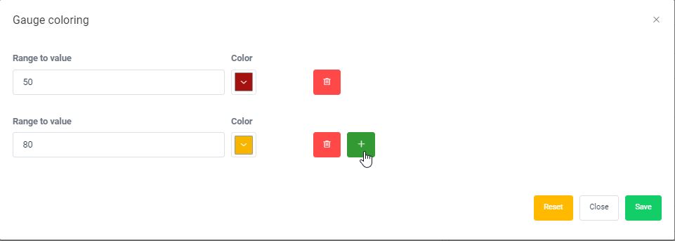
Gauge coloring (Button)
Allows you to set the entire scale in color according to the user’s requirements
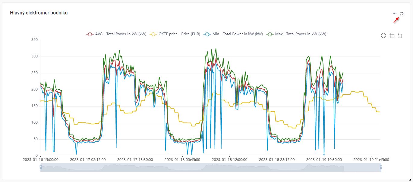
For the Time scale chart, the list of fields is as follows.
Aggregation interval
Specifies the time for which the data will be aggregated. The numerical size as well as the aggregation unit can be set right here.
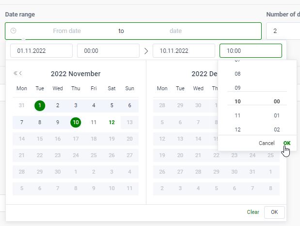
Time window
Specifies the time period that will be displayed on the chart. If I set 2 days, then on the graph I will see the data for the last two days aggregated for the set Time Interval. The numerical size as well as the aggregation unit can be set right here. This field is only displayed when the Date Range and Floating Range radio buttons are turned off.
The values in the graph are continuously updated on the Board.
Date range
If the switch is off, the time width of the graph is controlled according to the set time window.
If the switch is on, it is possible to select an exact time interval with an accuracy of minutes.
Floating range
If the switch is off, the time width of the graph is controlled according to the set time window or the set date range.
If the switch is on, it is possible to select a dynamic time block from the Floating start value and define the number of such units through the value in the Floating window field. The size of the block corresponds to the size of the aggregation value, i.e. the exact time interval, accurate to the minute, from which the blocks will start to be loaded.
The values in the graph are continuously updated on the Board.
This model is preferably used for measurement in aggregation after work shifts.
Floating start
This field is displayed if the Floating range switch is on. From the set date and time, the data will be aggregated and visualized according to the size of the Time Interval, and the time just set represents the starting position from when the blocks will start to be logically counted.
Floating window
This field is displayed if the Floating range switch is on. The value of the floating window determines how many time blocks from the current time will be visualized backwards.
Number of decimals
This field determines with which decimal precision the values will be displayed.
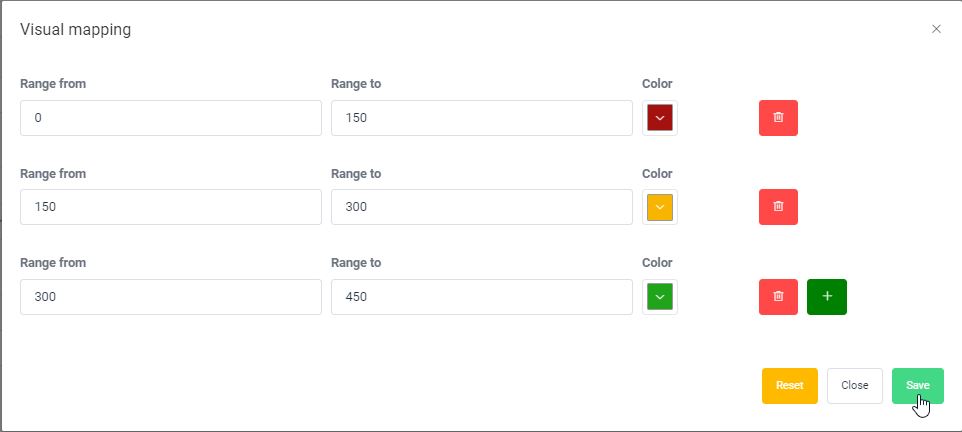
Visual mapping (Button)
This field allows you to set the color levels of the visualized attribute value on the timeline. The interval does not have to be continuous.
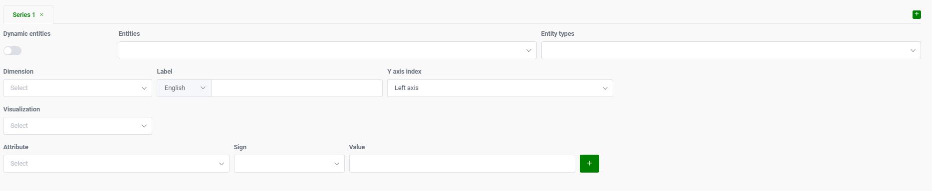
Data selection criteria of KPI definition and their fields
This is what the initial screen looks like for setting the data selection to the chart.
The list of individual fields and their applicability is as follows:
Tabs Series1 – SeriesX
It represents separate selection criteria that are visualized as one graphic element (line, column).
For time graphs, it is possible to use the (+) button in the upper right to make more Series definitions sequentially numbered, which makes it possible to translate several types of data on one timeline.
Entities
One or more Entities or logical structure nodes can be entered in the Entities field, which will be included in the selection. In the case of a logical node, the selection includes all entities of the given type selected in the Entity Types field from the selected logical level, including all lower levels in a direct line.
Entity types
One or more definitions of object types can be inserted into the Entity Types field (but usually one object type is enough), and according to the selected object type, fields for selection and processing are subsequently offered in the next section.
Dimension
In the field Dimension, it is possible to insert an attribute (type string) contained in the structure Types of subjects, according to which the data will be additionally grouped. If the field is not of type string, the aggregation will not work.
Label
You can insert a Label (separately for each language) in the Label field, which will replace the numbers from the Series tabs in the legend.
Y axis index
With the Y-axis Index field, you specify on which Y-axis the scale should be displayed. The field allows you to choose from two values (Left axis and Right axis).
Note: The default is the left axis. This function is advantageously used if the values of the visualized fields are in individual series with a large nominal difference. If all the data were displayed on one axis, the dynamics of the curve would be lost at orders of magnitude lower values.
Visualization
Defines the way the Component data is visualized. It has the following options:
Line chart
Bar chart
Stacked Bar chart
Note: A stacked column chart can only be used if the attributes to be stacked are in the same entity definition.
Example: If I want to visually display the separately registered consumption for phase no. 1 to phase no. 3 at one electricity measuring point.
Measure
The field allows you to select the attribute that will be visualized on the Component.
Note: In the case of a stacked bar chart, it is possible to select more than one attribute.
Only data changes (switch)
Only those data of the given attribute that came as input at the given time (time stamp) will be taken into account in the selection.
Note: It should be noted that it is not necessary to send all structure data to WorkSys at the same time, but it is also possible to send them time-selectively if, for example, a value changes. But the user always sees the last sent value on the digital point detail, but this does not mean that all the data was sent at the same time.
Aggregation function
Defines the method of data processing of the selected field (entity attribute). It has the following aggregation possibilities of the result in the given time interval:
Average(Average value)
Min (Minimum value)
Max (Maximum value)
Sum (Sums all values)
Lates value (The last value received from the device)
Legend unit
This field allows you to enter the unit in which the data is interpreted.
Note: If the definition of the object (entity type) has a unit assigned to the given attribute, it is automatically transferred to the field. But it is possible to modify it.
Restrictive selection criteria
Attribute
Specifies the field that will serve as the criteria for data selection.
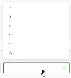
Sign
Specifies the logical operator of the selection condition.
Value
Specifies the value against which the value of the attribute in the logic of the selected operator will be taken into account during the selection.
Through the button (+) at the end of the condition line, it is possible to insert more limiting criteria and all of them are logically connected by the logical operator AND at thesame time it is true that (which in the programming language represents the expression AND).
In the next part, the establishment and options for individual Categories and Chart Types are described in more detail. Due to the universality of the form, it is of course also possible to fill in illogical combinations, but you don’t have to worry about that. Nothing happens at all, you just don’t see anything :-) . In the next section, we will only deal with meaningful combinations.
The Performance Dashboard offers fast and clear data viewing and sharing, uncomplicated data analysis, and better control and management of IoT assets. In addition, it enables data-driven businesses to find previously undiscovered insights, make more effective business decisions in real time, and uncover new prospects for growth or savings. Using more complex information panels in the Performance Dashboard with constantly improving tools, you can easily process your data into graphs without the need for programming skills. You can easily extract useful insights from your data much faster and more transparently, thus easily gaining a competitive advantage.
Even for this account, there are functions on the component itself that help save your time and increase the speed of obtaining information in real time.
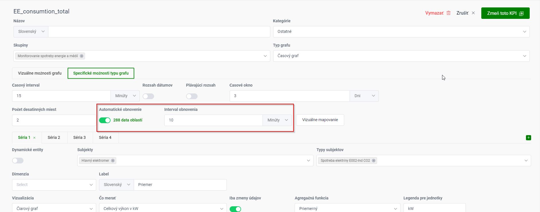
Setting the data refresh on the chart
This icon can be used to force a manual update.
Use the Automatic refresh switch to choose whether the graphs should be automatically refreshed. Behind the switch, a number is displayed about the number of displayed points (buckets) in the graph depending on the values of the selection criteria.
In the Refresh interval field, you set the number of minutes after which the data from the graphs are automatically updated.
Ability to display a component from PD in full screen
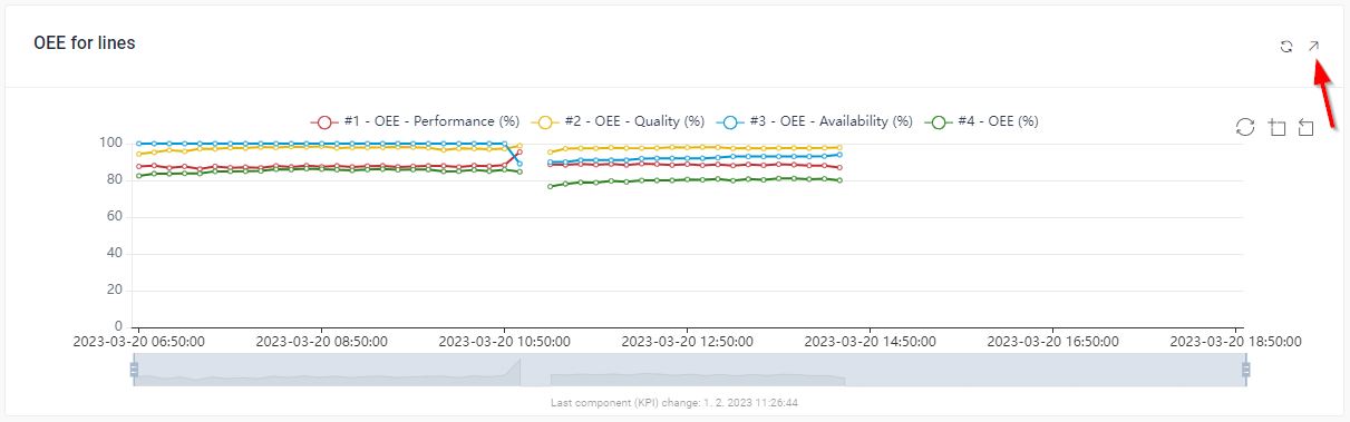
Increasingly, WorkSys panels are appearing as part of the production process itself on the screens on the line. By simply clicking the icon (see image) it is possible to enlarge any component to the full screen (e.g. the current full shift progress of OEE) and to return it to its original state by simply pressing the ESC key.
Thanks to the possibility of including images, video, or other parts of company software that can be linked via iframe (allows you to include content from external sources on your worksys pages) in the component, it is also a good tip for instructions or assembly manuals.
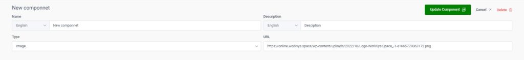
Performance Dashboard - Creating a component of type Image
Insert an image visible from the WEB
The Image component can be used if I need to visualize an image file type available on the Internet. To visualize it, just insert a link to the corresponding image in the URL field (e.g. https://online.worksys.space/wp-content/uploads/2022/10/Logo-WorkSys.Space_-1-e1665779063172.png )
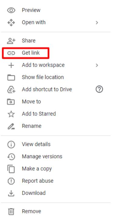
Insert your own image
In the case of your own image, you must first ensure that it is visible on the web. Of course, it is possible to use several options to place an image on the web, but we will give an example of how to do it with the help of Google Drive, which is available to every user.
The first step is to save the selected image to your google drive. Then, stand on the given image that you want to get to the platform and press the right mouse button and select the Get link option.
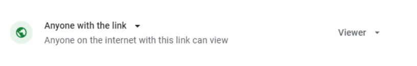
Copy the name of the given image, which is located in the area marked on the image.
Then enable who will be able to see the given image on the option. Anyone with the link
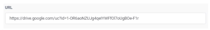
Paste the copied text into the URL field. Then After pressing the Save component button, the component is created and appears on Board.
Performance Dashboard – Creating a component of type Video
Just as when creating an image, now after selecting the Video Type, you need to enter the URL link of the video file from where the video will be loaded.
Note: A very common video source is e.g. YouTube, but we recommend embedding it as an iframe Type.
Performance Dashboard - Creation of a component of type Rich text
The Rich text component is used in Board for creating headings and header marking of component blocks.
After selecting the Text field component, the following screen will appear, which allows normal text formatting and setting the text type.
Note: For a Rích text field component, it is not necessary to fill in the Name or Description fields, as the text itself is often fully sufficient.
Performance Dashboard - Creating an iframe component
When creating an Iframe type component, you need to enter the URL link of the page or part of it, from where the given part of the website is to be loaded.
We can show it on YouTube content just as well.
Step No.1
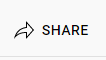
You can share the same on YouTube and with the video, select the option Share which you want to use.
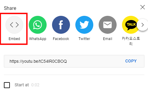
Step No.2
After opening the Share option, select the first Embed window shown in the image below.
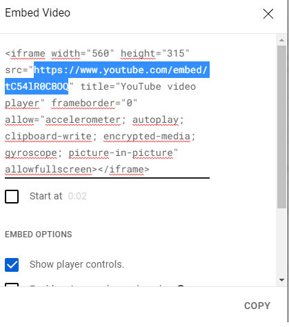
Step No.3
After selecting it, a window will open with a text similar to the one below, from which you must copy the part of the youtube page that is in quotation marks
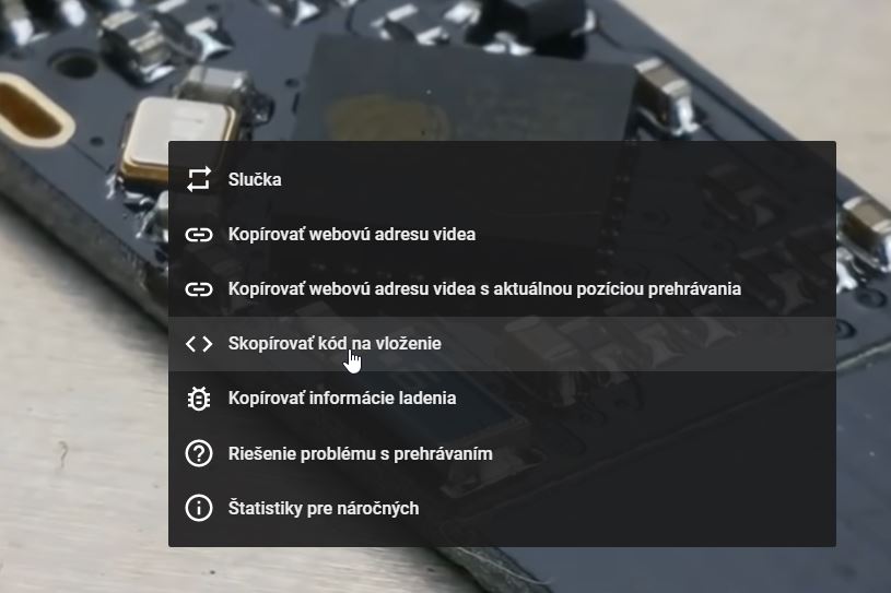
You can also get the mentioned code by pressing the right mouse button according to the following image directly from the running YouTube video.
Step No.4
Then you insert the given page into the URL field for the iframe type and save the component.
Digital Intelligence
Digital Intelligence
The system allows you to functionally link your own Business Intelligence or Digital Intelligence system directly from the platform for deeper and more detailed data analysis. The most frequently interconnected systems are e.g. Qlik, Power BI, Tableau and more. It is also possible to share their visual data interpretations (widgets) in the Performance Dashboard system.
Likewise, under the Digital Intelligence section, it is possible to configure another, analytical type of software that will help to gain a deeper understanding of the measured and collected data.
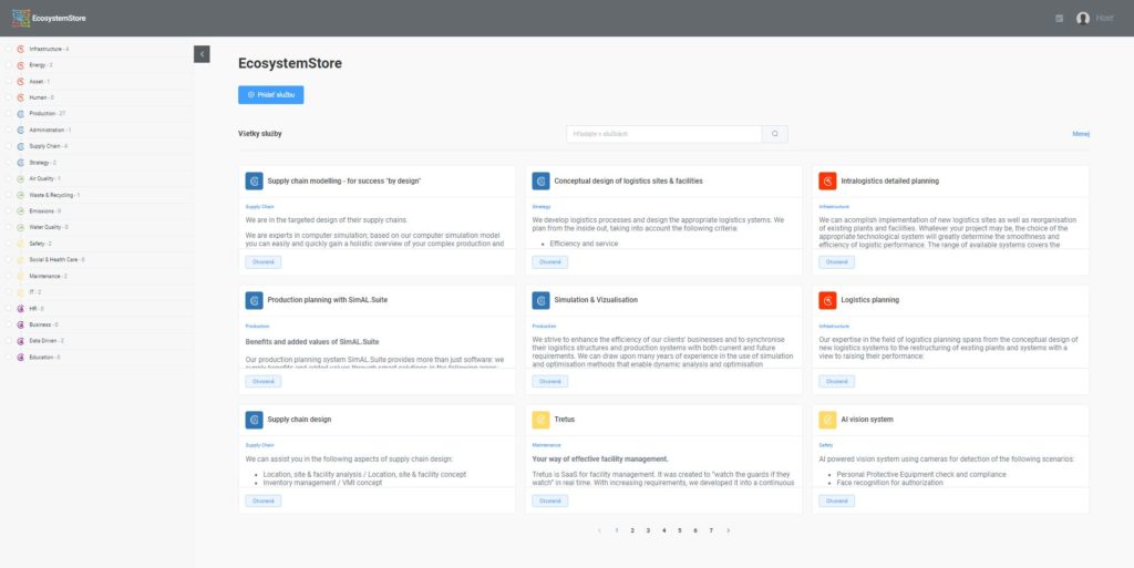
EcosystemStore
Ecosystem Store
It concentrates and catalogs proven solutions in practice and offers customers the first alternative when looking for the appropriate functional part to cover the need for digitization of the given part. It is possible that you will find more possible alternatives there to solve your need. Of course, the WorkSys system allows you to integrate solutions other than those listed, including those you already have installed.
Language selection for the web graphical interface
By clicking on the given icon, you can smoothly switch the communication language. Among the basic installed languages are (Slovak, Czech, English, German). If necessary, the supplier can add another necessary language.
User profile
By clicking, you will see the option to change your supplier profile, or log in or log out correctly from EcosystmeStore.
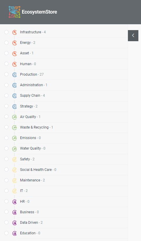
EcosystemStore - Left menu
The left menu, or tree of areas, serves as a graphically controlled filter for the list of loaded Panels.
For each item in the list, there is a number describing the number of registered solutions.
The list of displayed Panels is selectively changed based on the clicked categories. If no category is clicked, all Panels created by the user or shared for him are displayed.
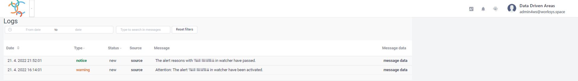
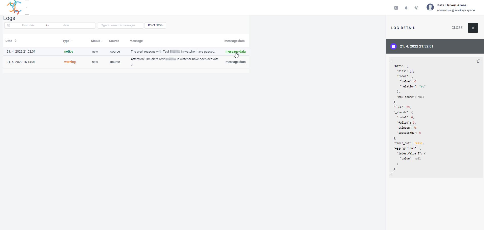
Logs&Events
Log & Events
This part of the platform concentrates all important system reports and incidents, including notification reports. This gives you an absolute overview of everything that is happening in your tenant and whether everything is going according to your expectations.
Logs & Events is used to collect notifications from the platform and devices. The data are sorted in the timeline as they were created and in the list they are sorted from the newest information to the oldest. The displayed information can be filtered by date (range from/to) and it is also possible to search for text in the logos.
Data structure
Date
The date of creation of the record
Type
It represents the level of significance of the information. The system works with the following types of reports:
Debug
Info
Notice
Warning
Error
Alert
Emergency
Critical
Status
Identifier of notification processing status – new, seen, and done values.
Source
The origin of the notification – after clicking on it, a window with details about the sender and other technical information that helps to understand the source of the cause will appear in the right menu.
Message
The text of the message or notification itself
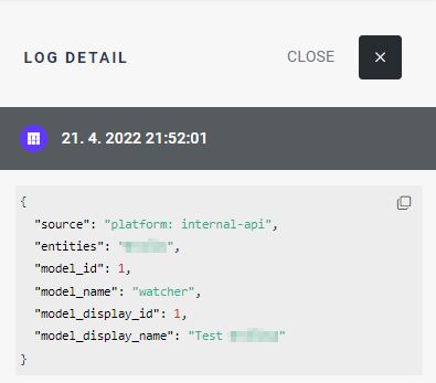
Message data
Expanding report data – parameters and other technical information.


